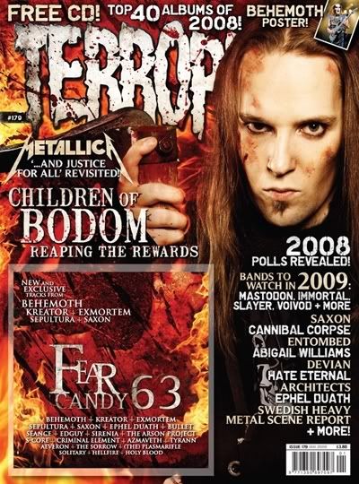
Language: As in all metal magazines, the idea of the magazine is to look threatening and aggressive. Take for example the medium-close up used in the main image is to make it seem as if the music genre is "in your face"
Institution: We know that this is a commercial magazine as it has a bar code which means it is being sold in shops for money. The publisher of this magazine is Dark Arts Ltd. The magazine also has a website to back it up.
Ideology: The ideology of the magazine is to promote the genre of music Metal and also to promote the bands.
Audience: The main audience would be males in the social class C1, C2 and B. They would be apart of the social stereotype "Mosher" and would have a keen interest in music, and other things like skating. The general age of readers would be 14-25
Representation: The main image is modeled so that the person in it looks aggressive. This is so that he relates with the aggressiveness of the music that he creates. The color scheme is red, black and orange. Red and orange representing fire and the black representing the dark side of things. Also, the fonts used all give a sense of evil.
No comments:
Post a Comment