
Friday, 18 December 2009


Thursday, 17 December 2009
Target Audiance of my Magazine
I believe, from my research, that the main target audience of my magazine would be people who are aged 14-25. This is because this is the main age range of people who listen to the genere of music that my magazine is about. The main social stereo-types who would read my magazine is "emo" "punk" and "mosher". This is because these stereo-types are knows for listening to the type of music that my magazine will be about. The social main social class who would be reading my magazine is c1, c2 and b. This is because these classes aren't very high classes and the magazine will be Farly cheap.
Double Page Spread Analysis 3

Language: Once again, the language used would be angry and aggressive to represent the genre of music that the magazine covers and the music that the band plays. This is also matched for the body language displayed in the main image.
Institution: The double Page spread here has no advertisements of their magazine or other companys, but it does mention the band's website, which gives the band more publicity.
Ideology: The ideology of the double page spread is to adversities and talk about the band at hand. It would talk about the band's recently released new albums and also talk about their live shows. The main ideology of the magazine is to talk about Rock, metal and punk and raise awareness of them as music genres.
Audience: The audience would be people who are interested in the music genre of metal who also are fans of the band Lamb of God. The main age range would be people aged 14-25.
Representation: The main look for the main image is to try and show a demonic look. The eyes are kept red and the rest of the image are black and white. This would be to show that the band has a dark side that they aren't afraid to show. The bands logo is also placed on the magazine to show that the band is successful and has a logo that people would recognise. The main models facial expression shows that he is angry, this is to show that he is a aggressive person and it represents the genre of music that he plays.
Double Page Spread Analyasis 2

Language: All very agressive language, text and body language of the modle in the pictues. This is to show the agressiveness of the genere of music which the band plays. It is also to show the attutide of the band that the double page spread is covering.
Institution: It shows that it is a commercial as it has the Kerrang! logo in the top right hand corner.
Ideology: The ideology of this double page spread is to talk about the band Avenged Sevenfold. It would talk about their albums and their rise to fame. Also the main ideology of the whole magazine is to talk about rock, metal and punk as much genres.
Audience: The audience of this double page spread would be people who are interested in the music that the band featured makes. Also, the audience would be people who are looking for new bands to listen to. The main age range would be 14-25 years old.
Representation: All the pictures that have been taken are all pictures of live performances. Several pictures would have been taken and the best looking pictures would have been cearfullyselected to give the best effect for the band.
Wednesday, 16 December 2009
Double Page Spread Analysis 1

Language: The language used in this double page spread would be mainly informative language as the article is telling us about the band. But despite it being informative, it would still stick with its aggressive and threating language as the magazine is about rock and metal music.
Institution: Again, we know that the magazine is an commercial magazine as it is advertising their website in the top left corner, and by the looks of it in the top right corner it is advertising subscribing to their magazine. It is also helping to advertise the bands tour by naming all the UK tour dates.
Ideology: The main ideology of this double page spread is to talk about the band Five Finger Death Punch and tell the audience why they are one of the best new bands on the metal scene. Again it is also raising awareness of Metal as a whole.
Audience: It is a clear cut audience here, the main audience of this double page spread would be fans of the band, or people who are looking for new music to listen to and find this band interesting.
Representation: The color scheme of the double page spread is red, black and gray. This is to relate with the music genre that the band is. The name of the band is in big, bold, red font so that if you are flicking through the pages it will easily catch your eye. In the main picture, the front man of the band has been placed in front of all his band mates to show that he is the main man. The picture was also placed on the street to show that they are rough people. Furthermore, it is slight discolored.
Contents analys 3

Language: In contrast to the other magazines that i have wrote about, this magazine is less aggressive so it uses much more calmer language. Take for example where it says "He's just showing off" it is much more calmer that other magazines. This is because of the type of music that the magazine reviews. Its more Indie, light rock and pop.
Institution: The magazine, just like the other magazines i have wrote about, is a commercial magazine, this is because it is still in it to make money. Also we get the idea because of in the top left hand corner it shows the "Q" logo. It also adversities the "Q" magazine website.
Ideology: The ideology is to advertise and review indie, light rock and pop music. The people who are interested in this music would be much more main-stream that the other magazines i have wrote about.
Audience: The audience would be a much wider audience that the other magazines, i would say from about 13-35. This is because the music that is in this magazine is main stream music and has many more fans than the other magazines i have wrote about.
Representation: The colour scheme of the magazine is much more bright that the other magazines i have wrote about as the magazine has a more easy tone to it. The main image just shows a band that is in a casual state of mind on a grassy hill. This would be to show how easy going the band is. Also, the font in the magazine is more casual than the other magazines i wrote about.
Friday, 11 December 2009
Contents Page Analaysis 2
 Language: Again, as with other contents pages, the language would be used to try and make all the articles and stories in the magazine look interesting and compelling. Most of the language used would be stuff that is aggressive and threatening as it is a rock and metal magazine and is just going with the trend.
Institution: Once again, the band is a commercial magazine as it is clearly in it to make money. We get this idea as they have an advertisement to try and get people to subscribe the their magazine. Also there are advertisements in the magazine which also tells us that it is a commercial magazine.
Ideology: Once again, the main ideology of the magazine is to promote the metal, rock and punk genre of music. The magazine is does things like advertise albums, reviews albums, reviews bands and gives gig guides.
Audience: The audience, the same with the other contents page i wrote about, would be people who are interested in what the magazine would have to offer. Take for example Live Reviews , Gigs, Album reviews and other advertisements that are through out the magazine. Again, aged 14-25.
Representation: Again, the images in the contents page will all have been modeled to look aggressive and advertising to the people who are reading it. The main story in the magazine has a bigger picture and block that any of the other stories to make the audience notice it first and to make it look more interesting. The main image in the magazine is a picture of the lead singer of the band. He would have been modeled to have his shirt off so that we can see his tattoos as that is a common interest around people who listen to their music. He would also have been told to make the hang gesture to make himself look big and assertive.
Contents Analasis 1
 Language: The language used is a big part of the contents page as it gives an idea what kind of topics will be in the magazine. Take for example where it says "Massive 8 page review." The language is used to try and make the festival that it is reviewing a big festival, also, the fact that it describes the view as "Massive"makes it look like the article must be good, as well as long. This would make the audience more interested and willing to read it. Also, to relate with the style of rock and metal, where it says "I'd be really slutty if i were a girl for a day." It gives the idea of rebellion in which rock and metal is a big part of.
Institution: Even on the contents page we realise that the magazine is a commercial magazine as it gas advertisements, in which they would have put to make money. Also, they are advertise their own magazine to let you subscribe to the magazine. Once again this shows that the company is in it to make money.
Ideology: Judging by the articles in the magazine, the ideology of the magazine is to review band and albums, keep people up to date with the latest news in the music scene, interviews on already big bands and also to advertise band tours with the gig guide. This is all limited to the genre of rock, punk and metal music, meaning the ideology is based around those music genres.
Audience: Again, judging by the stories in the magazine, the audience would be aimed at people who are interested in the latest news in music, or people who like to go to music shows because of the gig guide. Also, a general audience would be people aged 16-25 who are interested in the music genres of Metal, Rock and Punk.
Representation: The main image in the contents page is placed on the top right of the magazine, next to the main story in the magazine. The pictures show bands that are playing on stage. Lots of pictures would have been taken for this magazine, as they couldn't model them if they are playing a live show. A picture that would have been modeled for the magazine is the picture of the band Slipknot at the bottom center of the magazine. The band is known for wearing masks so they would have been asked to wear them as that is the idol that they are known for. The lead singer is placed at the front of the pack to show that he is the main band member. Also, the background is black to show that the band is a "dark" band. All the font on the magazine is big and bold, especially the name of the stories to draw the audience's attention to it.
Thursday, 10 December 2009
Music Magazine Analaysis 3.
Language: As in all metal magazines, the idea of the magazine is to look threatening and aggressive. Take for example the medium-close up used in the main image is to make it seem as if the music genre is "in your face"
Institution: We know that this is a commercial magazine as it has a bar code which means it is being sold in shops for money. The publisher of this magazine is Dark Arts Ltd. The magazine also has a website to back it up.
Ideology: The ideology of the magazine is to promote the genre of music Metal and also to promote the bands.
Audience: The main audience would be males in the social class C1, C2 and B. They would be apart of the social stereotype "Mosher" and would have a keen interest in music, and other things like skating. The general age of readers would be 14-25
Representation: The main image is modeled so that the person in it looks aggressive. This is so that he relates with the aggressiveness of the music that he creates. The color scheme is red, black and orange. Red and orange representing fire and the black representing the dark side of things. Also, the fonts used all give a sense of evil.
Friday, 27 November 2009
Music Magazine Analaysis 2
 LANGUAGE: The language used in this magazine front cover is language that is related to the music genre of metal. For example, where it says "Somebodies gonna get killed" gives off connotations of aggression, which is all apart of the genre of metal, which is related the the ideology of the magazine.
INSTITUTION: The ideology of the Magazine is KERRANG! what is a commercial institution. We know it is a commercial institution by the fact the magazine has a bar code, which shows that the magazine is sold in shops for about £3.99.
IDEOLOGY: The main ideology of the magazine is music of the genre of metal and rock.
AUDIENCE: The audience of the magazine would be people who aged 10-25 for people who are interested in the music genre of rock and metal. As the magazine is more on the alternative side, not as many people would read it, but for the people who enjoy this kind of music it is very well known.
REPRESENTATION: The main image of the magzine is very close up which suggests that the magazine and the band featured in the magazine has a very "in your face" attitude. Also, the fact that the mask that he is wearing is made to look angry it also suggests that the band that is featured in the magazine is a very aggressive band.
Image taken from http://www.ukmagz.co.uk/magslist.php?mag_char=K
Friday, 13 November 2009
Music Magazine Analaysis 1

LANGUAGE: As in all metal music magazines, the language is used in a way to make everything look aggressive and threating, since that what the music genre metal is, angry and aggressive.
INSTITUTION: The institution of the magazine is Future Publishing, which is commercial as they created the magazine to make money. "Metal Hammer" also have their own radio station and website.
IDEOLOGY: The ideology of the magazine is to promote the genre of music Metal. On this magazine its main ideology is to try and advertise "The Unholy Alliance" tour. The magazine will also include stories on other bands, live show listings and album reviews.
AUDIENCE: The general audience of Metal Hammer would mainly be mainly male C1, C2 and B class people. Also the odds are the people who buy this magazine would have a keen interest in music and would be apart of the social stereo-type "metal head"
Friday, 6 November 2009
LIIAR
Language: The text used, pictures used all picked carefully to create the best effect for the magazine.
Institution: The company or body of people who created the magazine.
Ideology: What the magazine is about, take for example a fishing magazine or a music magazine.
Audiance: Who the magazine is aimed at, usualy depending on what type of magazine it is. Examples of audiance could include Sex, Age, Job and Social Class. An example of a magazine aimed at different genders is Heat magazine, which is usualy aimed at Woman. Am example for age is a childrens TV show magazine, such as the "Ben 10 magazine." An example of Job magazines is a magazine about builders and Social Class magazines could be music magazines, such as different types of music aimed at different social classes.
Representation: How everything is represented on the page, for example the representation of the main image.
Brief: Music Magazine
Main Task: The front page, contents, and double page spread of a new music magazine. All images and text used must be origional, produced by you - Minimum of four images.
Friday, 23 October 2009
Evaluation
Before I began to design my magazine, I looked at several other magazines to get some form of idea of what to do. I believe that I have managed to create a decent looking magazine front cover as I have used several conventions of a magazine front cover, I have made things like the magazine name sound like a professional name, and I also believe that the picture I have used for my magazine front cover looked like a professional medium close up. But I also believe that on some aspects of my magazine front cover it wasn’t very well planned. The font I used was a very simple font and I could have used something that was more eye catching. Also when it came to cutting out the picture it wasn’t cut very good and looked sort of rushed. I also belive that I could have done some more drafts for my contents page as I only did one and I used that draft.
I believe that the image that I used was good to relate to the mean cover line. The main cover live said “folders, are they really as good as people say they are” and the picture included two people looking into a folder looking rather puzzled. I placed this picture in the centre of the front cover so that people would see it and wonder what the story is about. I also think that the other cover lines I used were realistic storeys that you would find in a real college magazine.
The font I used was very simple and in white, this was to go with the colourer scheme of my magazine front cover which was light blue, white and black. I choose these colours as they aren’t to out standing and wouldn’t make it look like a magazine about something else.
I think that my research stage went well as I analysed 2 magazine covers and a contents page. Despite the good analyse I believe I should have done more than what I did and if I did I would have had some better ideas for my magazine front cover. I also think that I could have done more on the basic conventions on a magazine front cover.
I think that my planning also went very well. I managed to make 2 drawn drafts or my magazine front cover and one draft of my contents page, and I believe that all my drafts where very imaginative and original. Despite this, I also believe that I could have done more drafts to I would have had chance to put more ideas down on paper.
I think that I managed my time well, as I had plenty of time to fully complete my magazine front cover and contents page, I also believe I evenly spread out my time spent researching and planning. If I could improve anything about my time management it would be to not do as much of my work in lesson time and do a bit more at home.
Overall I believe that I did a good job on my magazine. I found that using Publisher to put it together was much easier than using Photoshop. If I could improve anything it would be my picture taking skills as even though I thought the picture that I took was professional, the only reason I picked it was because the other 2 pictures weren’t as good as that one.


Wednesday, 21 October 2009
Planning: Rejected Pictures.


These are some of the other pictures that i took as my main image for my front cover, but i choose not to use them.
Planning: Choosing my main picutre.

Over all i have took 3 pictures. I took 3 pictures as i belived if i had more choise it would help improve the finished product. I have chosen to use this picture as it looks much more natural than the other two and i belive it is better quality.

Planning: Front Cover 2
 This is the front cover i am bacing my finised product on. I choose this one because it is more imaginative and te infomation is spread throughout the page more, unlike my other draft.
Planning: Front Cover 1
 I choose not to use this one as i belive that it was a very simple design. also i belive that all the infomation on it was all pressed to one side when it should have been spread throughout the page.

Friday, 16 October 2009
LIIAR
Language
Headline, Title, Slogan.
Institution
BBC, Internet, Radio, TV.
Ideology (magazine topic)
College, Music, Food, Animals ect..
Audience
Age, Sex, Occupation, Sexuality, Interests.
Representation
How its presented.
Headline, Title, Slogan.
Institution
BBC, Internet, Radio, TV.
Ideology (magazine topic)
College, Music, Food, Animals ect..
Audience
Age, Sex, Occupation, Sexuality, Interests.
Representation
How its presented.
Thursday, 15 October 2009
Contents page.

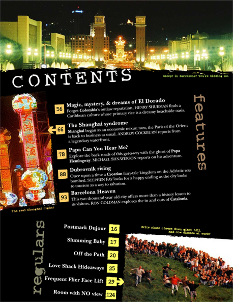
All of the storeys in the magazine can help us know what the magazine is about, so take the name of the storeys, for example "Emoticon Designers" and "the Flaws of Adobe CS4" it is clear to us that the magazine is about technology and people who are interested in the Internet. It also has a small description of the story underneath the name of the story so we can have a small taster of what we are about to read and also to try and also to try and suck us in to read it.
Analysis of a collage magazine cover.
 Taken from www.assumption.edu/.../winter06/default.html.
Masthead - Written in a sophisticated font to signify that this is a magazine about serious things. Also linked to education as it is a College magazine.
Dateline - Right next to the masthead so you know who published the magazine, what volume it is and when it was published.
Main Image - Linked to the main cover line, which is "Quest To China" it shows a picture of the person who the main cover line is about.
Coverlines - This magazine doesn't really use alot of coverlines, but it does use some. The main headline, "Quest To China" really captivates people into reading as instead of using a simple coverline like "one girls journey to china" it uses the word quest. It also uses smaller coverlines to help give an insight to what is in the magazine.
Wednesday, 14 October 2009
Wednesday, 7 October 2009
Target Audiance
The target audiance is important for all magazine producers to consider, becuase if you aim it at the wrong kind of people then the odds are that your magazine will not go that far. You need to take into mind lots of thing such as; age, sex, class, where you live, occupation, interests and sexuality. Say if you create a fishing magazine for the more middle aged people, if you use lots of cartoon pictures you won't be getting the audiance you want.
Wednesday, 30 September 2009
Magazine Front Cover Analysis.
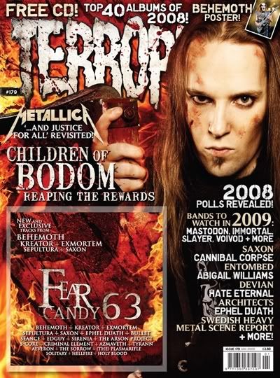
 Image taken from... http://www.futurelicensing.com/title_images/metal_hammer_177.jpg
- Picture - The picture shows the lead singer of the band called Children of Bodom, this shows that if you like this band then you would want to read what the artical about them is about.
- Headline - The headline says "Children of Bodom" which, like the main picture, tells us that one of the main articals in the magazine will be about that band, meaning people who like that band would want to read on.
- Strapline - The Strapline says "Welcome to their nightmere" this shows that the main artical is going to be about their career. Plus the reason the headline says "welcometo their nightmere" is because since the band is a metal band it tries to relate to the idea of darkness. This could also be to realte to the target audiance. mag
- Barcode - Also includes the date and issue number. This is so that the reader knows how much the magazine will cost, what date the magazine was issued and issue number so you know how many issues of the magazine have been created.

Conventions of a college magazine contents page.
- Pictures...Helps get a closer look at what's inside.
- Page Number... So people know what page the artical is on.
- Name of artical... So people know what they are looking at and get a small idea of what the artical is actually about.
- Description of artical... Just like the name of the artical, it helps give people understand what they are reading, but it give a bit more infomation in order for people to properly understand it.
Conventions of College Magazine Front Cover.
- Main headline - It is big and eye catching, and is to headline the main subjects of the magazine. Take the name of "secondary teachers" for example, the word secondary gives the idea it is for people aged 13-16 and teachers is the target audiance.
- Picture - The picture on this magazine is a school student in a uniform holding his hand up to answer a question. This would help relate to what is going to be mentioned in the magazine.
- Date - Important so the reader the reader knows they are getting the issue they want.
- What is inside the magazine... Gives us a taster of what is in the magazine so that they get interested and want to read on.
- Website - So people know who makes the magazine and where to go if they want anymore infomation.
- Logo - Something that you reccognise to make you know you are getting whta you asked for.
The Brief
Preliminary exercise: using DTP and an image manipulation program, produce the front page of a new school/college magazine, featuring a photograph of a student in medium close- up plus some appropriatley spread laid-out text and a masthead. Additionaly you must produce a mock-up of the layout of the contents page to demonstrate their grasp od DTP.
Main task: the front page, contents and double page spread of a new music magazine. All images and texts used must be original, produced by you - minimum of four images.
Presentatiion of your work
The presentation of the reaserch, planning and evaluating may take the form of any one, or combined of two more, of the following.
- A presentation using slideshow software such as powerpoint;
- a blog
- a podcast;
Subscribe to:
Posts (Atom)